The Psychology Behind Visual Communication
The psychology of visual communication operates on fundamental principles of human cognition and perception that have evolved over millennia to help us rapidly process, interpret, and respond to visual information in our environment. Visual processing occurs significantly faster than textual comprehension, with the human brain capable of interpreting complex visual scenes in as little as 13 milliseconds, making visual communication an extraordinarily powerful tool for immediate impact and emotional engagement. This rapid processing relies on pre-cognitive mechanisms such as pattern recognition, color association, and spatial relationships that bypass rational analysis to create immediate emotional and psychological responses. Cultural conditioning plays a crucial role in visual interpretation, with colors, symbols, shapes, and compositional elements carrying different meanings and emotional weight across different societies, age groups, and personal experiences, requiring designers to understand not only universal psychological principles but also specific cultural contexts of their target audiences. The psychological impact of visual elements operates on multiple levels simultaneously: colors can trigger physiological responses and emotional states, typography can convey personality and authority, spatial relationships can create feelings of comfort or tension, and imagery can evoke memories, aspirations, and subconscious associations that influence decision-making processes. Visual hierarchy leverages psychological principles of attention and perception, guiding viewers through information in predetermined sequences while managing cognitive load to prevent overwhelming the audience with too much simultaneous stimulation. Understanding these psychological mechanisms allows visual communicators to craft messages that resonate on both conscious and subconscious levels, creating more persuasive, memorable, and emotionally engaging communications that not only convey information but also influence attitudes, behaviors, and decision-making processes in measurable ways.
Strategy and Visual Communication
Strategy and visual communication are intrinsically linked, as each informs and enhances the other in creating impactful and effective communication. Visual communication design is the art of conveying messages and information through visual elements such as images, graphics, colors, and typography. Strategy, in this context, refers to a deliberate plan and approach that guides the entire design process, ensuring that the visual communication effectively meets its objectives and resonates with the target audience. This strategy focuses on understanding your audience first, keeping visual consistency throughout, and continually improving based on feedback and results to create effective communications that meet your goals.
Key Elements of Visual Communication Design
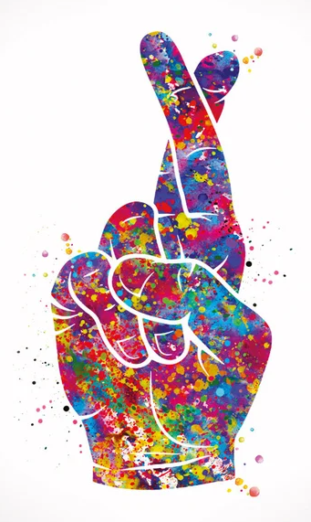
Color: Sets the mood, emphasizes elements, and influences emotional responses. Different colors evoke different feelings and can be strategically chosen to align with the message.
Typography: Refers to the style, size, and arrangement of text. Font choices, spacing, and hierarchy contribute to readability, tone, and overall aesthetic.
Imagery: Includes photos, illustrations, and icons. Images can tell stories, evoke emotions, and simplify complex ideas.
Layout and Composition: How elements are arranged within a design. A well-organized layout guides the viewer's eye and ensures the message is easy to follow.
Shapes and Lines: Create structure, direct focus, and evoke different feelings or meanings (e.g., curves suggest fluidity, angles suggest stability).
Contrast: Creates visual interest, emphasizes key elements, and improves readability by using differences in color, size, shape, or texture.
Alignment: Arranges elements neatly, creating a sense of order and professionalism.
Texture: Adds depth and visual interest to designs, even in digital contexts.
Developing a Visual Communication Strategy
Define Your Goals: Identify the purpose of your visual communication (e.g., inform, persuade, educate) and what you want to achieve.
Understand Your Audience: Research your target audience's demographics, interests, cultural background, and how they interact with visual content.
Choose the Right Visuals: Select the most appropriate visual formats (e.g., images, videos, infographics) to effectively convey your message to your specific audience and purpose.
Plan Your Layout and Composition: Arrange elements strategically to create a clear visual hierarchy, guide the viewer's eye, and ensure readability.
Maintain Consistency: Develop and adhere to a consistent visual brand identity across all visual communications, including colors, fonts, logos, and graphic styles.
Tell a Story with Visuals: Structure your visuals to create a narrative that engages the audience and makes the message more memorable.
Prioritize Simplicity and Clarity: Avoid clutter and focus on one main idea per visual, ensuring the message is easily understood.
Establishes Visual Communication Design as Both Art and Strategic Practice
By embracing these principles and focusing on a strategic approach, visual communication design can become a powerful tool for conveying messages, captivating audiences, and building strong brand identities in an increasingly visual world. Visual communication design is the tool, and strategy is the roadmap that guides the effective use of that tool. By combining a clear purpose, deep audience understanding, and thoughtful application of design principles, you can create visual communication that truly resonates and achieves its desired impact. The successful execution that turns the initial idea into a powerful, measurable result.


Visual Communication Design: Leveraging Elements
The effectiveness of visual communication design lies in its ability to transcend language barriers and appeal to diverse learning styles while maintaining consistency across multiple platforms and touchpoints. By establishing clear visual hierarchies, designers guide viewers' attention to key information while supporting brand identity through cohesive color schemes, typography choices, and imagery styles. This systematic approach enables organizations to build stronger connections with their audiences, whether the goal is to educate, persuade, or inspire action, ultimately transforming abstract concepts into tangible visual experiences that drive engagement and achieve measurable results. These elements work together in visual communication design to create designs that are not only visually appealing but also impactful and effective at conveying the intended message to the target audience.
Visual communication design leverages various elements to convey messages effectively through visual means by strategically combining imagery, typography, color, and layout to create compelling narratives that resonate with target audiences. This multidisciplinary approach draws from graphic design principles, psychology, and marketing to transform complex information into digestible visual formats. Designers utilize tools such as infographics, charts, illustrations, and multimedia content to bridge the gap between raw data and audience understanding, ensuring that messages are not only seen but truly comprehended and retained.


Key Elements:
Color: Color is a powerful tool in visual communication, setting the mood and influencing emotions. It affects how the audience perceives the message and can be used to create emphasis or a sense of harmony.
Typography: Typography refers to the style and appearance of text. Font choices, spacing, and size affect readability and visual hierarchy, guiding the viewer's attention and communicating the message's tone.
Imagery: Images, including photos, illustrations, and icons, are essential for explaining ideas visually and adding depth to the design. They make content more engaging and help viewers quickly understand complex information.
Layout and Composition: These elements determine how visual elements are arranged on the page, ensuring clarity and ease of navigation. A well-structured layout guides the viewer's eye through the content, emphasizing key points and creating visual interest.
Shapes and Lines: Lines create structure, define space, and direct the viewer's eye. Shapes add visual interest and can convey symbolic meanings.
Contrast: Contrast helps elements stand out, drawing attention to specific details and enhancing readability. It can be created using differences in color, size, shape, or texture.
Alignment: Alignment creates a clean, organized look by positioning elements purposefully. It improves readability and makes designs appear professional.
Space (including white space): Space refers to the area around and between elements. White space (negative space) provides visual breathing room and helps to highlight elements.
Texture: Texture, both physical and implied, adds depth and tactile interest to a design, enhancing its visual appeal.
User Experience (UX) Design Becomes Essential
Key Responsibilities
User Research and Analysis: UX designers conduct interviews, surveys, and usability testing to understand user needs, behaviors, and pain points. They analyze data to identify patterns and insights that inform design decisions.
Information Architecture: They logically organize and structure content, creating site maps and user flows that guide people through a product efficiently. This involves determining how information should be categorized and connected.
Wireframing and Prototyping: UX designers create low-fidelity wireframes to map out page layouts and functionality, then build interactive prototypes to test concepts before full development begins.
Usability Testing: They regularly test designs with real users to identify problems and validate solutions. This iterative process helps refine the user experience based on actual feedback rather than assumptions.
Collaboration: UX designers work closely with product managers, developers, visual designers, and stakeholders to ensure the user experience aligns with business goals and technical constraints.
Design Systems: They often contribute to or maintain design systems that ensure consistency across products and teams.
Essential Skills
Research Methods: Proficiency in qualitative and quantitative research techniques, including user interviews, surveys, A/B testing, and analytics interpretation.
Design Tools: Expertise with industry-standard software like Figma, Sketch, Adobe XD, or similar platforms for creating wireframes, prototypes, and design specifications.
Psychology and Human Behavior: Understanding of cognitive psychology, behavioral patterns, and accessibility principles to create designs that work for diverse users.
Communication: Strong ability to present and justify design decisions to stakeholders, write clear documentation, and facilitate workshops or design sessions.
Problem-solving: Analytical thinking to break down complex user problems and develop creative, practical solutions within real-world constraints.
Systems Thinking: Ability to see how individual design elements fit into larger user journeys and business ecosystems. The field combines creative problem-solving with analytical thinking, making it appealing to people who enjoy both understanding human behavior and creating practical solutions to improve people's digital experiences.
By bridging the gap between human needs and technological capabilities, UX designers play a crucial role in creating digital products that do not just function well but truly serve the people who use them. In an increasingly complex digital landscape, their work ensures that technology enhances rather than hinders our daily lives.
User Experience Design: Creating Meaningful Digital Interactions
In the digital-first world, the success of any product depends not just on what it does, but on how effortlessly users can accomplish their goals while using it. This is where User Experience (UX) design becomes essential. A UX designer focuses on creating meaningful and usable experiences for people interacting with digital products such as websites, mobile apps, and software. Their primary goal is to ensure that products are intuitive, accessible, and enjoyable to use.
The Strategic Impact of UX Design
UX design has evolved far beyond making things look attractive—it's now a critical business strategy that directly impacts a company's bottom line. Research shows that every dollar invested in UX returns between $2 and $100, with companies that prioritize user experience seeing significant improvements in customer satisfaction, retention rates, and revenue growth. When users can easily navigate a product and accomplish their tasks without frustration, they're more likely to become loyal customers and advocates for the brand.
Core Principles of Effective UX Design
Successful UX design is built on several foundational principles. User-centricity places the needs, behaviors, and goals of users at the center of every design decision. Usability ensures that products are easy to learn, efficient to use, and memorable. Accessibility guarantees that products work for people with diverse abilities and circumstances. Consistency creates predictable patterns that reduce cognitive load, while simplicity eliminates unnecessary complexity that might confuse or overwhelm users.
The UX Design Process
The UX design process typically follows a structured approach that begins with research and discovery. Designers conduct user interviews, surveys, and observational studies to understand their target audience's pain points, motivations, and behaviors. This research informs the creation of user personas—fictional but data-driven representations of typical users—and user journey maps that visualize how people interact with a product over time. During the ideation phase, designers generate multiple solutions through brainstorming sessions, sketching, and collaborative workshops. These ideas are then translated into wireframes and prototypes that allow teams to test concepts quickly and cost-effectively before investing in full development. Prototyping can range from simple paper sketches to interactive digital models that closely simulate the final product experience.
Testing and Iteration: The Heart of UX
User testing is where theoretical design meets real-world validation. UX designers conduct usability tests, A/B experiments, and accessibility audits to identify areas where users struggle or become confused. This feedback loop is crucial—it reveals gaps between designer assumptions and actual user behavior. The iterative nature of UX design means that products are continuously refined based on user feedback and changing needs.
Collaboration and Cross-Functional Impact
Modern UX designers rarely work in isolation. They collaborate closely with product managers to align design decisions with business objectives, work with developers to ensure technical feasibility, and partner with marketing teams to maintain consistent messaging across touchpoints. This collaborative approach ensures that UX considerations are integrated throughout the entire product development lifecycle rather than being treated as an afterthought.
Measuring UX Success
Effective UX design is measurable through both quantitative and qualitative metrics. Quantitative measures might include task completion rates, time-on-task, error rates, and conversion metrics. Qualitative feedback comes from user satisfaction surveys, Net Promoter Scores, and direct user feedback. The most successful UX teams establish clear success metrics early in the design process and continuously monitor these indicators to guide future improvements.
The Future of UX Design
As technology continues to evolve, UX designers are adapting to new challenges and opportunities. The rise of voice interfaces, augmented reality, artificial intelligence, and Internet of Things devices is expanding the definition of user experience beyond traditional screens. Designers must now consider how people interact with products across multiple devices and contexts, creating seamless experiences that adapt to users' changing needs and environments.
The field is also placing increased emphasis on ethical design practices, considering the long-term impact of digital products on users' well-being and society as a whole. This includes designing for digital wellness, protecting user privacy, and ensuring that technology serves to empower rather than manipulate users.
UX design represents the bridge between human needs and technological capabilities, transforming complex systems into intuitive, valuable experiences that improve people's lives while achieving business objectives.


Technical Writing Skills for Communication Professionals
Digital Proficiency and Social Media Savvy: This involves understanding and utilizing digital platforms and social media for effective communication, crafting targeted messages for diverse audiences, managing online communities, and staying up-to-date with social media trends.
Visual Storytelling and Multimedia Proficiency: Professionals should be able to convey information through engaging visuals, produce and edit multimedia content, and utilize visual storytelling to effectively enhance their messages.
Content Strategy and SEO Knowledge: This includes creating content aligned with goals and audiences, optimizing it for search engines using SEO practices, and understanding how search algorithms work.
Data Analysis and Performance Measurement: The ability to interpret data from analytics tools to track metrics like website traffic and social media engagement is essential for making data-driven decisions.
Proficiency in Communication Technologies: Staying updated on advancements in communication software, including AI and machine learning, helps leverage tools for better processes and personalized interactions.
Content Management System (CMS) Proficiency: Familiarity with platforms like WordPress or Drupal is important for managing content.
Email Marketing: Knowledge of email marketing strategies, campaign creation, and performance analysis is valuable.
Basic Graphic Design: Having skills in creating visually appealing content is beneficial.
Video Production Basics: Understanding the fundamentals of video production, from planning to editing, is important for creating engaging video content.
Technical Writing: The ability to translate complex technical information into clear language is a key skill.
These technical skills form the foundation of modern communication excellence, enabling professionals to create, distribute, and optimize content across the full spectrum of digital channels. As technology continues to advance at an unprecedented pace, mastering these competencies is not merely advantageous—it's essential for career sustainability and growth. Communication professionals who invest in developing these technical capabilities will be well-positioned to adapt to emerging trends, deliver measurable results, and maintain their relevance in an increasingly digital-first world. These competencies collectively enable professionals to effectively communicate across digital channels, create engaging content, and measure success through data-driven insights. The convergence of creativity, strategy, and technical expertise defines the future of effective communication, making these skills indispensable for success in the field.
Core Digital Skills:
Digital platform mastery and social media expertise for audience engagement and community management
Visual storytelling capabilities and multimedia content creation/editing
Strategic content development with SEO optimization and search algorithm understanding
Analytics and Technology:
Data interpretation from analytics tools to measure performance and guide decision-making
Proficiency with evolving communication technologies, including AI and machine learning applications
Content Management System expertise (WordPress, Drupal, etc.)
Specialized Communication Areas:
Email marketing strategy, campaign development, and performance analysis
Basic graphic design for creating visually compelling content
Video production fundamentals from concept through post-production
Technical writing skills to make complex information accessible
The rapidly evolving digital landscape requires communication professionals to master a diverse array of technical skills to remain effective and competitive. The integration of technology into every aspect of communication—from content creation to audience engagement—has fundamentally transformed the field. Modern communicators are expected to be digital natives who can seamlessly navigate multiple platforms, create compelling multimedia content, and leverage data-driven insights to optimize their strategies. Effective communication for professionals demands a blend of traditional skills and a strong grasp of technical tools and platforms. These technical skills, combined with traditional communication strengths such as writing and strategic thinking, are crucial for success in the evolving field of communications. The following technical competencies represent the essential toolkit for contemporary communication professionals who seek to excel in this dynamic environment.
Technical Writing and Visual Communication
Principles of Visual Communication in Technical Writing:
When integrating visuals into technical documents, it's essential to adhere to key principles to maximize their impact.
Clarity: Ensure visuals are easy to understand and avoid clutter.
Design: Organize elements effectively for a cohesive and aesthetically pleasing composition.
Contrast: Utilize color, size, and other visual cues to highlight important information and guide the reader's eye, says Blue Sky Graphics.
Proximity: Group related elements together to signify their connection.
Rhythm: Arrange elements in a way that creates a sense of order and flow.
Integrating Visuals Effectively:
To effectively integrate visuals into technical writing, technical writers should follow these guidelines:
Purposeful Graphics: Only include visuals that clarify and emphasize information, not for decoration.
Appropriate Placement: Place visuals as close as possible to the relevant text, ensuring they don't disrupt the flow of reading.
Clear Titles and Labels: Number and title visuals descriptively and label all units, axes, and other relevant details.
Introduce and Discuss: Introduce visuals in the text before their appearance and discuss their key aspects or significance after the visual.
Accessibility: Consider accessibility for users with disabilities by including alternative text for images and avoiding small or difficult-to-read text.
Consistency: Maintain a consistent style, font, and formatting for all visuals within a document.
Cite Sources: Cite any graphics or data borrowed from other sources.
Technical writing and visual communication are crucial aspects of creating effective technical documents. Visuals play a significant role in enhancing clarity, engagement, and accessibility for a diverse audience, ultimately improving the user experience and ensuring information is readily understood and retained. The thoughtful integration of visual communication into technical writing significantly enhances the effectiveness of conveying complex information. By adhering to key principles, technical writers can create documentation that is clear, engaging, and accessible to a wide range of users.
Technical writing simplifies complex information, ensures product and process clarity, reduces risks, and drives customer satisfaction and business efficiency. In a world filled with increasingly complex products and services, it serves as the crucial bridge between experts and the end-user.
For Users and Customers
Empowers users: Clear, concise user manuals, guides, and FAQ sections enable customers to use products confidently and independently, without relying on technical support.
Boosts satisfaction: High-quality documentation improves the user experience by helping people use a product to its full potential. This increases customer loyalty and strengthens brand credibility.
Accelerates product adoption: Well-structured and easy-to-understand instructions facilitate a smoother onboarding process, encouraging customers to explore and utilize all features.
For Businesses and Employees
Improves efficiency: Technical documents, such as Standard Operating Procedures (SOPs) and training materials, ensure consistent processes, which reduce errors and accelerate employee onboarding.
Reduces costs: Clear documentation can significantly lower support costs by enabling users to troubleshoot issues, thereby decreasing the volume of support inquiries.
Preserves institutional knowledge: Technical writing captures critical information about products, systems, and procedures, ensuring that important knowledge is not lost due to employee turnover.
Fosters collaboration: Internal technical documents help team members, even those from different departments, understand the technical details of a project or process. This is especially vital for teams that work remotely or asynchronously.
For Industries and Compliance
Ensures compliance: In regulated industries such as healthcare, finance, or government, technical documentation is a legal requirement. Precise documents, such as regulatory reports and policy manuals, help companies adhere to industry standards and minimize legal liability.
Mitigates risk: By communicating proper safety precautions and usage instructions, technical writing informs users about potential hazards and reduces the risk of accidents.
Facilitates innovation: Analysis of user feedback on documentation provides critical insights that can inform and improve future product development.
For Software Development
Enables developers: In software development, technical writing produces API documentation and architecture documents that are essential for other developers to integrate and build upon a system.
Supports rapid cycles: With agile and DevOps development, documentation must keep pace with constant code changes. Writers now iterate on documents continuously alongside developers to stay in sync with the product.
Clarifies code: Technical writers create explanations that help developers and other practitioners understand complex code, systems, and infrastructure.
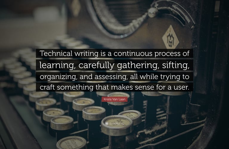
Importance of Visuals in Technical Writing:
Simplifying Complex Ideas: Visuals like diagrams, flowcharts, or infographics can break down intricate processes, structures, or data into easily digestible chunks, making them more accessible and understandable.
Enhancing Engagement: Visuals break up long stretches of text, capturing attention and keeping readers engaged. This is particularly important in today's fast-paced world with dwindling attention spans.
Bridging the Knowledge Gap: Visuals cater to diverse learning styles and can bridge the gap for users with varying levels of technical knowledge. Visual learners, for instance, may find it easier to grasp concepts through diagrams and images rather than solely through text.
Improving Retention: Studies suggest that humans process and retain visual information more effectively than text alone. This means visuals contribute to better long-term memory of the information presented.
Enhancing User Experience: Visuals can guide users through processes, especially in tutorials or how-to guides, by providing visual cues and preventing them from feeling overwhelmed.
Types of Visuals Commonly Used:
Technical documentation leverages a wide variety of visuals to effectively convey information. These include:
Tables: Organize and compare detailed data, often numerical, in rows and columns.
Charts and Graphs: Visualize data trends, relationships, or distributions. Examples include line graphs, bar graphs, and pie charts.
Diagrams: Explain processes, structures, or systems in a visual format.
Flowcharts: Illustrate the sequence of steps in a process or procedure.
Screenshots: Capture real-time images of software interfaces or webpages, providing a direct glimpse of the system being documented.
Infographics: Combine data and graphics to present information concisely and engagingly.
Videos and GIFs: Offer dynamic demonstrations or short, looping visuals for illustrating processes or changes over time.
Photographs: Show what something looks like in realistic detail or illustrate it in use.
Technical writing simplifies complex information, ensures product and process clarity, reduces risks, and drives customer satisfaction and business efficiency. In a world filled with increasingly complex products and services, it serves as the crucial bridge between experts and the end-user. In today's rapidly evolving technological landscape, where innovation outpaces comprehension and complexity often overshadows usability, the art and science of technical writing has emerged as an indispensable cornerstone of effective communication. As organizations across industries develop increasingly sophisticated products, implement intricate processes, and navigate complex regulatory environments, the gap between technical expertise and practical understanding continues to widen. This divide creates significant challenges: engineers struggle to convey their innovations to stakeholders, product teams find it difficult to translate features into user benefits, and customers become overwhelmed by incomprehensible documentation that obscures rather than illuminates. The consequences of poor technical communication ripple through entire organizations, manifesting as increased support costs, user frustration, regulatory compliance failures, and ultimately, diminished competitive advantage in markets where clarity and accessibility can determine success or failure.
Types of Employment in Visual Communications
A degree in visual communication opens doors to a diverse range of creative and strategic careers. Visual communication involves using visual elements such as images, typography, diagrams, and video to convey information and ideas, shaping how people perceive and interact with messages and brands.
The following are some potential jobs to pursue with a degree in visual communication:
Graphic Designer: Create visual content for print and digital media, including logos, advertisements, websites, and marketing materials.
Web Designer: Design and develop user interfaces and experiences for websites and applications, focusing on visual appeal and functionality.
Illustrator: Create drawings and artwork for various media like publications, advertisements, and packaging.
Video Editor: Edit and combine video footage with other elements like images and sound to tell stories and convey messages effectively.
Photojournalist: Document news and events through photography and video, often writing captions and headlines to accompany the visuals.
Visual Designer: Focus on the visual aesthetics and branding for digital projects, ensuring consistent messaging across various platforms.
Communications Manager: Oversee a company's image and messaging, developing promotional content and managing communication strategies, including visual materials.
Art Director: Lead and oversee the visual aspects of design projects, providing creative direction for images, layouts, and overall aesthetics across various media like advertising, film, and magazines.
Multimedia Designer: Combine various media like images, video, and audio to create interactive and engaging content for different platforms.
Advertising Professional: Develop and implement visual strategies for advertising campaigns, using their understanding of target audiences and visual communication principles.
Motion Graphics Designer: Create animated graphics and visual effects for video, film, and other digital content.
Visual Communication Degrees
Photojournalist: Photojournalists combine photography skills with journalistic principles to tell stories through images. They capture newsworthy events, document social issues, and create visual narratives for newspapers, magazines, websites, and other media outlets. This role requires technical photography expertise and the ability to work under tight deadlines and often involves traveling to cover breaking news, sports events, or human interest stories. Photojournalists must understand ethical guidelines, have strong visual storytelling abilities, and be able to work independently in various conditions.
Video Editor: Video editors assemble raw footage into polished final products for films, television shows, commercials, social media content, and corporate videos. They work with editing software to cut scenes, add transitions, incorporate graphics and text, synchronize audio, and create seamless narratives. The role involves collaborating closely with directors and producers, managing multiple project timelines, and staying current with evolving editing technologies and techniques. Video editors need strong attention to detail, storytelling instincts, and technical proficiency with industry-standard software.
Web Designer: Web designers create the visual layout, user interface, and overall aesthetic of websites and digital applications. They focus on user experience design, ensuring sites are both visually appealing and functionally intuitive. This involves creating wireframes, selecting color schemes and typography, designing responsive layouts for different devices, and collaborating with developers to implement their designs. Web designers must understand current design trends, accessibility standards, and how visual elements impact user behavior and conversion rates.
Graphic Designer: Graphic designers create visual content for both print and digital media, including logos, brochures, advertisements, packaging, and marketing materials. They combine typography, imagery, and color to communicate messages effectively and reinforce brand identity. The role involves client consultation, concept development, and producing final designs that meet specific objectives and brand guidelines. Graphic designers work across various industries, balancing creativity with commercial requirements and technical production constraints.
Visual Designer: Visual designers focus on the aesthetic aspects of digital products, creating cohesive visual systems for websites, mobile apps, and software interfaces. They develop style guides, design systems, and visual elements that ensure consistency across all user touchpoints. This role is similar to graphic design but specifically emphasizes digital environments and often involves creating scalable design components. Visual designers work closely with UX designers and developers to ensure their designs are both beautiful and functional.
Communications Manager: Communications managers develop and execute comprehensive communication strategies across multiple channels and media types. They oversee brand messaging, manage crisis communications, coordinate with media outlets, and ensure consistent visual and verbal communication across all company touchpoints. While not always creating visuals directly, they guide visual communication decisions and often manage teams of designers and content creators. This role requires strong project management skills, strategic thinking, and the ability to translate business objectives into effective communication campaigns.
Art Director: Art directors provide creative leadership and vision for visual projects across advertising agencies, publishing companies, film studios, and corporate marketing departments. They conceptualize campaigns, guide the overall aesthetic direction, and manage creative teams, including designers, photographers, and illustrators. Art directors are responsible for ensuring creative work aligns with client objectives and brand standards while maintaining high artistic quality. This senior-level role requires extensive design experience, leadership abilities, and the capacity to present and defend creative concepts to clients and stakeholders.
A visual communicator is a person or system that uses images, videos, graphics, typography, and other visual elements to convey a message, information, or data. They work in fields like graphic design, photography, digital marketing, and using tools to create compelling visuals like infographics, presentations, and motion graphics that make complex ideas easier to understand, more memorable, and more engaging for an audience. The skills acquired with a visual communications degree are highly valuable across numerous industries, including advertising, marketing, media, entertainment, IT, education, gaming, and e-commerce. The job market for visual communication professionals is expanding, with robust growth in areas like e-commerce, digital marketing, and gaming. Many visual communicators also find opportunities for remote work and freelancing. Keep in mind that while a degree in visual communications provides a strong foundation, experience and a compelling portfolio are also crucial for securing these roles and advancing your career.


Visual Communication Design: Language and Images
Visual communication design is the practice of creating and presenting visual elements like images, typography, color, and layout to convey messages, ideas, and information effectively. This field combines technical skills in areas such as digital image creation and typography with conceptual and critical thinking to produce memorable and impactful visual products for targeted audiences. Designers use both language (typography) and images to tell stories, solve problems, and influence behavior across various media, from advertising and branding to data visualization and web design.
Elements: Visual communication uses various components to create a message:
Images: Photos, illustrations, icons, and other visual representations.
Typography: The style, arrangement, and use of text and fonts.
Color: Used to evoke emotions, create contrast, and convey meaning.
Shapes and Lines: Provide structure and form to a composition.
Layout and Composition: The arrangement and organization of visual elements.
Principles: Guidelines help designers create successful and cohesive designs:
Balance: Distributing visual weight evenly.
Contrast: Using differences in elements to create interest.
Hierarchy: Arranging elements to show their order of importance.
Unity: Creating a sense of harmony among the design elements.
Purpose: The goal of visual communication design is to:
Convey complex information in a simple, understandable way.
Create a memorable impression on the audience.
Influence consumer behavior and promote ideas.
Break down language barriers to reach a wider audience.
The Integration of Language and Images
Words and Pictures: Visual communication design uniquely combines written language (typography) with images. This allows for a richer, multi-layered communication experience where words and visuals enhance each other.
Storytelling: Designers use this integration to tell stories, create experiences, and communicate complex concepts in an engaging way.
Examples: The combination is evident in advertising campaigns, book design, web design, and even simple logo design, where typography supports and works with an image or symbol.
Career Opportunities in Visual Communication
Career Opportunities in Visual Communication
Visual communication has created an increasingly digital and media-saturated world, and the ability to communicate effectively through visual means has become more valuable than ever. Visual communication—the practice of conveying ideas, information, and messages through imagery, design, and multimedia—sits at the intersection of art, technology, and strategic thinking. A degree in visual communication opens doors to a diverse array of career paths that span traditional media, digital platforms, corporate environments, and creative industries.
The field has evolved dramatically with technological advances, creating new specializations while maintaining the core principle that visual storytelling can inform, persuade, and inspire audiences more powerfully than words alone. Whether working with static images, motion graphics, interactive media, or comprehensive brand experiences, visual communication professionals serve as the bridge between complex ideas and accessible, engaging content. This versatility makes graduates valuable across virtually every industry, from healthcare and education to entertainment and e-commerce.
Career Opportunities
The following are some potential jobs to pursue with a degree in visual communication:
Graphic Designer: Create visual content for print and digital media, including logos, advertisements, websites, and marketing materials.
Web Designer: Design and develop user interfaces and experiences for websites and applications, focusing on visual appeal and functionality.
Illustrator: Create drawings and artwork for various media like publications, advertisements, and packaging.
Video Editor: Edit and combine video footage with other elements like images and sound to tell stories and convey messages effectively.
Photojournalist: Document news and events through photography and video, often writing captions and headlines to accompany the visuals.
Visual Designer: Focus on the visual aesthetics and branding for digital projects, ensuring consistent messaging across various platforms.
Communications Manager: Oversee a company's image and messaging, developing promotional content and managing communication strategies, including visual materials.
Art Director: Lead and oversee the visual aspects of design projects, providing creative direction for images, layouts, and overall aesthetics across various media like advertising, film, and magazines.
Multimedia Designer: Combine various media like images, video, and audio to create interactive and engaging content for different platforms.
Advertising Professional: Develop and implement visual strategies for advertising campaigns, using their understanding of target audiences and visual communication principles.
Motion Graphics Designer: Create animated graphics and visual effects for video, film, and other digital content.
Conclusion
The career landscape for visual communication graduates is both broad and dynamic, reflecting the universal need for clear, compelling visual storytelling in our interconnected world. From traditional roles like graphic design and illustration to emerging fields such as motion graphics and multimedia design, these positions offer opportunities to combine creative expression with strategic problem-solving.
What unites all these career paths is the fundamental skill of translating complex information into visually accessible formats that resonate with specific audiences. As businesses increasingly recognize the importance of strong visual identity and user experience, demand for skilled visual communication professionals continues to grow. The field rewards those who can adapt to new technologies and platforms while maintaining a keen understanding of design principles, audience psychology, and effective communication strategies.
For aspiring visual communication professionals, the key to success lies in developing both technical proficiency and conceptual thinking skills. Building a strong portfolio that demonstrates versatility across different media and contexts, staying current with design trends and software, and understanding how visual choices impact audience behavior will position graduates for rewarding careers in this ever-evolving field. Whether working as in-house creatives, freelance specialists, or agency professionals, visual communication graduates have the tools to shape how information is shared and experienced in our visual culture.
Visual Marketing Psychology Principles
The psychology of visual communication operates on fundamental principles of human cognition and perception that have evolved over millennia to help us rapidly process, interpret, and respond to visual information in our environment. Visual processing occurs significantly faster than textual comprehension, with the human brain capable of interpreting complex visual scenes in as little as 13 milliseconds, making visual communication an extraordinarily powerful tool for immediate impact and emotional engagement. This rapid processing relies on precognitive mechanisms such as pattern recognition, color association, and spatial relationships that bypass rational analysis to create immediate emotional and psychological responses. Cultural conditioning plays a crucial role in visual interpretation, with colors, symbols, shapes, and compositional elements carrying different meanings and emotional weight across different societies, age groups, and personal experiences, requiring designers to understand not only universal psychological principles but also specific cultural contexts of their target audiences. The psychological impact of visual elements operates on multiple levels simultaneously: colors can trigger physiological responses and emotional states, typography can convey personality and authority, spatial relationships can create feelings of comfort or tension, and imagery can evoke memories, aspirations, and subconscious associations that influence decision-making processes. Visual hierarchy leverages psychological principles of attention and perception, guiding viewers through information in predetermined sequences while managing cognitive load to prevent overwhelming the audience with too much simultaneous stimulation. Understanding these psychological mechanisms allows visual communicators to craft messages that resonate on both conscious and subconscious levels, creating more persuasive, memorable, and emotionally engaging communications that not only convey information but also influence attitudes, behaviors, and decision-making processes in measurable ways.
Career Possibilities
The career landscape for visual communication graduates is both broad and dynamic, reflecting the universal need for clear, compelling visual storytelling in our interconnected world.
Brand Identity
Craft a unique visual identity that resonates with your audience and reflects your brand values. Get expert advice on visual strategies tailored to elevate your brand and engage your audience.
Compelling visuals are images, graphics, and multimedia that grab attention and evoke emotion. Transform your ideas into compelling visuals that capture attention and drive engagement effectively.
Compelling Visuals
Blending Creativity and Strategy to Enhance Visual Communication Design!